


Design trends for online shops
The year 2015 is now a good one and a half months old, and the speculation about new design trends for online shops. In the following, I will try to summarise some speculations and filter out the most important design trends for 2015.
Design is always in the eye of the beholder, so I can’t give any instructions for a perfect design. Every online shop operator has to decide individually how to put his products in the foreground and which design he chooses to get the attention of potential customers.
Content is king and will always be king.
First of all, I have to make one thing clear: content is king and will always be king. With the design trends of 2015, the content of the site is clearly placed in the foreground. The content of a page is ultimately the decisive point that sells the product; the design only supports the actual expressiveness of the product.
First of all, this is the top priority, which I believe must be at the top of any e-commerce strategy in the years to come.
Now we come to the design trends, the actual topic of the article.
Optimised for smartphones and tablets
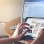
When you read the headline, a big keyword comes to mind: responsive web design. esponsive web design describes a way of displaying websites in a user-friendly manner on any mobile device. You know it yourself: you want to buy a new product; what do you do? Very few of them still drive into town and compare the prices in different shops.
Why the fewest? We have become comfortable; it is much easier to quickly order a new monitor on the tablet than to notice the unfriendly facial expression of the salesman in a specialty shop. Nowadays, there is the mobile shopping world, which makes it easier for interested parties to buy, compare, or even find a product first.
And this is exactly where it is important for shop operators to stay tuned. Perhaps they can also speak from their own experience. For example, if I want to buy a new product and I find an online shop where the advertisement is fairly small and I have to enlarge the image myself to even be able to see the image of the product, I can get out of there faster than that image could be loaded at all.
Here, the first impression failed for me, but it is a very important impression. If I come across an online shop that works with responsive design and in which I can quickly find my way around using a mobile menu, then I have fun looking for my product myself because I know that the shop owner depends on the customer by providing him with a user-friendly interface.
Now the exciting question arises as to whether the online shop should be displayed responsively or whether an app should be developed directly and made available in the store.
It’s true that a lot happens in apps; many people visit app stores to keep updating themselves with new apps. Owning your own app is something that not everyone can claim. That’s why my suggestion goes very clearly in the direction of app development, because then you’re simply in line with the trend of the time.
What do you need for that? You need knowledge of HTML5 and CSS3, a web service that reads the database of the online shop, and a programme that generates an app from the HTML and CSS files. My tip: Give the app development to specialists who know their trade, and you will get an app that you can make available to your customers in various app stores.
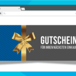
Full-width wallpapers with sophisticated effects
A full-width background emphasises the meaningfulness of the product photo. You want to present something and go into the full breadth of your own product. All the work to create beautiful product photos should not be in vain; show what you have and present your product, your appearance, or your relationship to the product in full.
Sophisticated effects such as parallax scrolling will also be found in many online shops in 2015 because this function leaves a positive impression on shop visitors and also looks good. However, you should also be careful with the function.
The products are at the centre of the shop, and there are no functions that have nothing to do with the product range. The dangerous thing about parallax scrolling is that the shop visitor is distracted from the actual purpose of the page, the actual product, by this “wow”” effect.
So my tip is: Less is better. Parallax scrolling is a really nice thing, but you have to be careful with it. One should therefore avoid the use of parallax scrolling in a product presentation in order not to distract the visitor from the product. For the landing page or the presentation of the company, the effect of the parallax scrolling comes into its own.
So to sum it up again, full-width background images underline the expressiveness of the product in whatever form. An effect such as parallax scrolling should be used with care, as this effect can sometimes distract from the real purpose of the page.
Flat or material design? Why not both?
As early as 2014, flat design was a popular type of display for online shops. In 2012, flat design was really noticed with the appearance of Windows 8. Gradually, well-known companies such as Apple and Google followed suit and also developed designs in flat format for their operating systems.
A further development of flat design is material design, whereby the simple and clear structures of flat design are also supported with attractive colour accents. So a mix of flat and material designs would be the ideal balance.
With a clear structure and an easy-to-understand presentation of the page, including colour accents that make the whole thing look even more beautiful, the overall design is an eye-catcher.
Dark colours were “in” in 2012, and everyone wanted them. Today, friendly colours that invite visitors to find out more prevail. So step into the future with bright, confident colours to keep visitors coming back to your online store.
Card design for user-friendly product presentation
When it comes to presenting mobile or desktop-oriented products, there is no way around card design in 2015. Card design describes a form of presentation in which the most important information about a product is summarised at a glance.
Most of the time, a short summary is displayed next to the price and a product image so that the interested party has everything at a glance. It sounds a bit like the early days of Facebook, where women were rated by their pictures by visitors to the site.
The difference is that the potential customer receives additional product information that can be important for his decision.
My tip: Keep the information as small as possible. A visitor to the site only wants important information about the product and does not want to read lengthy texts, from which sometimes only two or three lines are interesting.
So, less is more.
Ghost Buttons: Will they still be an option in 2015?
Definitely yes, because the trend will expand again in 2015. What initially turned out to be a boring option is now the dot on the i for every online shop. Ghost buttons have a minimalist form of representation; usually only the content and the border of the button are available. They have no background colour and are almost invisible.
But why all this?
You have a nice, large background image, but you want to add buttons and links. The option with the CSS code “opacity” makes the buttons almost disappear—not only the background but also the content.
Ghost buttons are exactly for this niche; they make the background invisible, but the content and the border are clearly recognisable. In this way, the beautiful large background image is not destroyed by the buttons and still achieves the goal of incorporating links.
A very beautiful thing. An insider tip for the future
Conclusion:
As I said at the beginning, I can only describe my impressions, which I consider meaningful in my eyes. But what can ultimately be found in your online shop is entirely your own. I only give incentives for a design that can have a positive impact on the potential customer.
If you don’t try it, you can never judge what it will look like in the end or how your customers will react to it.
Again, less is more. Better four lines of meaningful content than 100 lines of boring content that just invites the customer to switch sides.